Best Practices for Responsive Web Design
Responsive design has been all the rage since the term was coined by Ethan Marcotte back in 2010. Three years later it’s become a staple of modern web design to the extent that the majority of our client projects are now designed and built with some level of responsiveness in mind. The principle behind responsive design is fairly simple: CSS3 media queries can be used to target device properties such as screen resolution and CSS rules can then be applied to optimise the layout for that device.
We’ve designed and built a number of responsive projects at the lab including the website for the Museum of Australian Democracy, live music venue the Corner Hotel, and Melbourne’s Wheeler Centre. Along the way I’ve adopted some best practices which have proved extremely beneficial across these projects and more.
Keep it clean
It’s a seemingly obvious point (and not just applicable when talking about responsive design), but starting with clean, semantic markup will give you a solid base to later make complex layout modifications without restriction. At the same time, CSS should be neat and modular and used to control all aspects of presentation.
Always use descriptive class names to define blocks, especially when using a grid framework. If you’re making an existing design responsive (which we’ve done a number of times) you’ll find it much easier to manipulate a specific element if it has a unique identifier.
Easy to target:
<div class="feature-article row">
  <div class="feature-image grid-4"> ... </div>
  <div class="feature-text grid-8"> ... </div>
</div>
A whopping great headache:
<div class="row">
  <div class="grid-4"> ... </div>
  <div class="grid-8"> ... </div>
</div>
Consider your breakpoints
One way to make a design “responsive” is to use fluid, percentage-based layouts which scale as the viewport shifts. This approach, coupled with media queries that target common device sizes, will give you the best shot at building a robust responsive design that both looks great and behaves as you expect across a multitude of devices.
However, while targeting common breakpoints ensures your design looks pixel perfect across common devices, there’s every chance you’ll discover little oddities in those in-between states. Resize your desktop browser and those anomalies will become glaringly obvious: lists where a single item falls below its neighbour, a call-to-action with an awkward line ending, or a floated image that now looks far too dominating nested in a paragraph of text.
Consider the use of mini-breakpoints, that is breakpoints that are dictated by your design, to make nuanced changes. Not only will going that extra mile make your design feel better across all screen sizes, but you’ll be going a long way towards future proofing your site against yet-to-be-invented devices.
More than just design
Responsive thinking shouldn’t be limited to just removing horizontal scrollbars. Content should be restructured and restyled to fit the constraints of the viewport. For example, a large vertical navigation list that looks great on a desktop might take up the entire available space on an iPhone. Certainly not ideal.
Think about condensing navigation lists or search boxes when screen space is at a premium. Similarly, hiding superfluous elements (like labels) or abbreviating text (such as a timestamps or calls-to-action) is a great way to gain space. It’s also important to think about the needs of users accessing your site on specific devices. Consider moving or highlighting important information like opening hours and contact details on smartphone sized screens instead of leaving them buried below a large masthead.
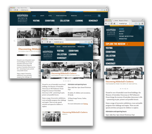
On the Museum of Australian Democracy site the navigation items are reorganised and the search box condensed as the viewport narrows.
From a technical perspective, don’t be afraid to wrap content in <span> tags or similar as styling hooks. It may feel a little messy but it’ll save a lot of future hassle.
CSS3 pseudo-classes are your friend
Even today I’m hesitant to go overboard with CSS3 pseudo-classes in client projects because of the need to support dinosaur versions of Internet Explorer. In most cases I’ll give all elements a class name based on their role (.navigation-about-us) and, if needed, use a .first or .last class to target a specific position.
When it comes to responsive design I’ve adopted a different mindset: the point of responsive design is to optimise desktop websites for smartphones, tablets, netbooks, fridges and everything in between. It’s not to present a pixel perfect layout to your grandmother’s 500px wide toolbar-heavy version of Internet Explorer 7 (you’ll need to use something like Modernizr to get media queries working on IE-old, anyway).
While we certainly shouldn’t turn a blind-eye to legacy browsers or older mobile devices, I feel the benefits of using selectors like :last-child, :nth-child(foo), and :first-of-type outweigh the disadvantages. Of course, you shouldn’t make the mistake of styling your entire layout based around CSS3 selectors (look mum, no classes!) – that makes things far too fragile. My general approach is to use classes to style the base layout and then pseudo-classes to make little tweaks as my design collapses.
Don’t be afraid to repeat yourself
In the end, there’ll always be a few design ideas that you won’t be able to execute with universal markup. When it comes to these exceptions: don’t be afraid to repeat yourself. While it’s true that you want to adjust the markup as a little as possible, duplicating a heading or phone number so that you can move it somewhere else in the DOM on a mobile layout is, in my opinion, a better approach than compromising the integrity of your design. You could do it with JavaScript, but I’d advocate using the display property to show/hide the element when the need arises.
Conclusion
There’s no single approach to responsive design. Fluid, fixed, many breakpoints, few breakpoints. It’s really up to the individual designer and the requirements of the project. That said, the structure of the design and the needs of your users should in some way dictate the way your layout collapses. In the responsive projects I’ve worked on I’ve found the above points to be universally applicable, so hopefully they can help you too.
Resources
Some useful tools and reading that have made the responsive design process a little easier:
- Rafal Bromirski’s set of SASS media queries mixins
- The Responsinator (test your site on common device resolutions)
- Window Resizer (a Chrome extension to find your viewport details and emulate common device resolutions)
- Ethan Marcotte’s original article, “Responsive Web Design” and the followup book