The Details Matter
Last month we launched a brand new website for Books Kinokuniya, which also happens to be one of my favourite bookstores in Sydney.
Designing the website was a fun and straightforward process; it was also my first since joining Icelab, and helped to break the, er, ice with the team.
We nailed down aesthetic and style quickly. The website had to look and feel like Kinokuniya’s existing brand guidelines but extend the community and creative aspects of its Sydney branch, who are doing a smashing job of promoting books and events to their diverse reader base.
One of the things I love about my job is how we communicate. We use a range of online tools suited to remote teams and through Slack I was able to share progress updates and fill in design details during the frontend phase.
One week, I began uploading screenshots of completed mobile and desktop designs. The project team narrowed in on a detail in the navigation and thus began an intense and rewarding forty minutes of design iteration. Here are some screenshots with chat snippets and background information:
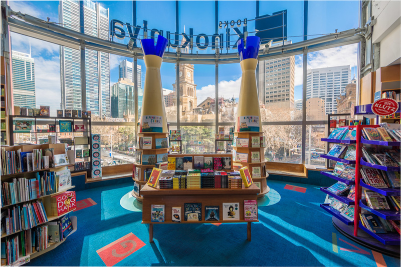
1. Reaction to original mobile nav design
The mobile navigation overlay shows necessary information for people accessing the site on the smartphones. It looks nice, but could use a bit more finessing in the opening hours.
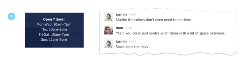
2. Differentiating opening days and times
It’s much easier to distinguish both, but the centre-aligned text makes you read in a zig zag shape.
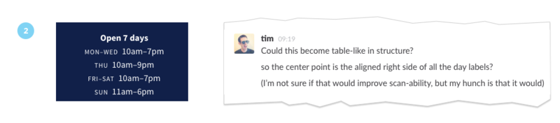
3. Playing around with alignment options
What happens when you right-align the days, and left-align the times? It feels better with clear negative space between both, but makes the whole block feel heavier on the right.
If we switch to left-aligning the days, the block feels more even on both sides. Also, make sure all abbreviations are uniform. The language used is just as important as the visual cues.
But something still doesn’t feel quite right.
Michael references Shawn Blanc’s and Tim’s articles on Benjamin Franklin’s daily schedule and suggests we implement curly braces.
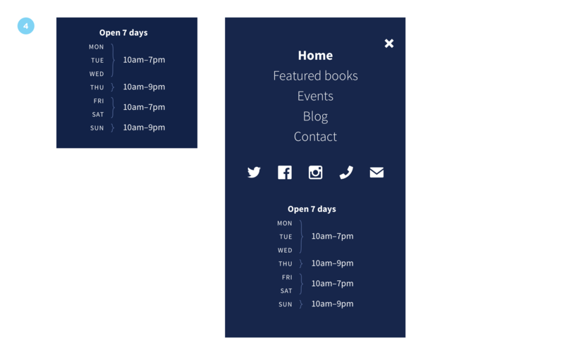
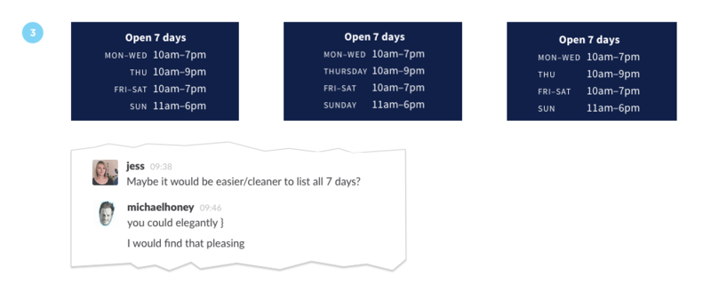
4. Final result
Voìla! The opening hours design feels cleaner, clearer and quite elegant with a hidden literary reference. A couple of icons for the store’s phone number and email have also been added.
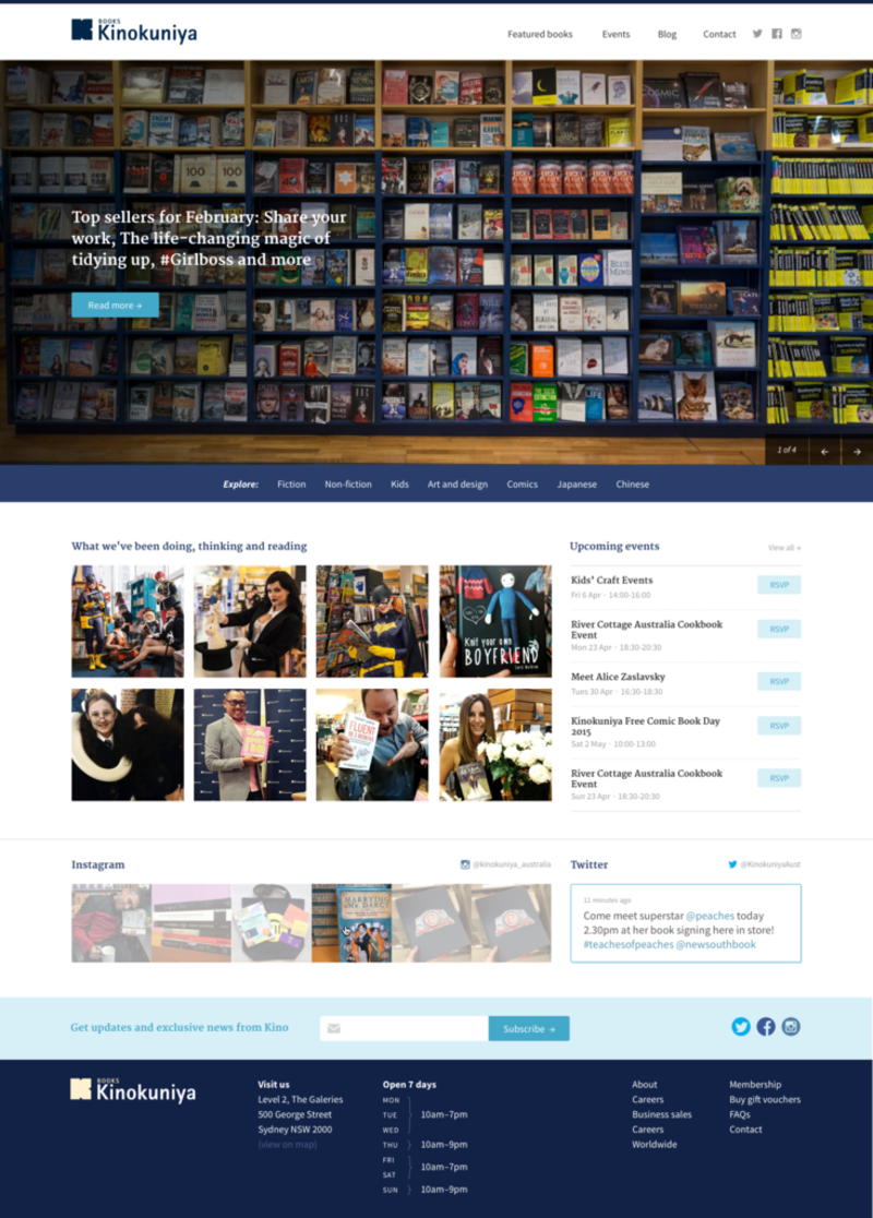
Here’s what it looks like adapted to the desktop design:
While this sort of iteration may scare some into thinking the whole team was art directing me, they were in fact offering valuable feedback.
As designers we become less sensitive to design details after having spent some time on the same project; a fresh perspective is often welcome at this stage to re-energise the project and cue in on what needs more work. It’s essential to recognise when this happens and trust your team, their expertise, and work together constructively to deliver the best result.