Visualising our weekly schedule
Scheduling work in a busy studio is a challenge: at the time of writing we have thirteen production staff working across a dozen or so active projects, some of which are in heavy development, others in maintenance mode, and others just popping up here and there. Understanding who’s doing what is hard.
We use a Sankey diagram to visualise our weekly work effort across the team.
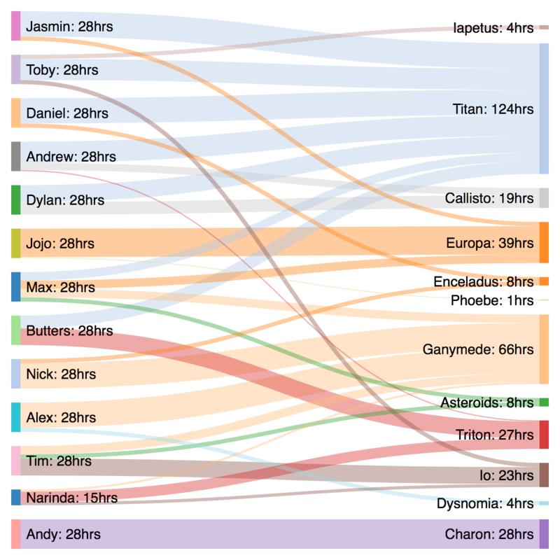
On the left, our people, with the number of hours they’re working that week. We work four eight-hour days per week (Fridays off) so a full-time load is 32 hours, modulo part time and vacations. But we understand how wait time is a function of busyness over availability, so we don’t book people up at 100% capacity: we leave room for those small-rock tasks which pop up from time to time. Also, we occasionally have to pee.
On the right, projects. For your team, it could be features, or clients. Typically, we have one or two major projects which are getting attention from multiple people. In this case, Titan is launching soon and we have a lot of people contributing. Other projects are full-time jobs for one person but others aren’t involved much. And Andy is working on Charon by himself this week.
This gives us an excellent overview of the total work effort going into our major projects, and it also lets us gauge how much our attention is being split. In this case, our design and development directors, Max and Tim, have their time split over multiple projects: for others in our team, we try to minimise context shifting.
Now, you could build you own Sankey diagram generator using, say, the output from your project-planning tool and d3. Or you could use a Google Docs spreadsheet and the wonderful Sankeymatic.