Decaf Sucks 2: A New Old Design
The iOS 7 betas are coming thick and fast. If we want to finish the rebuild of Decaf Sucks and ship it close to the iOS 7 launch, we need to be pragmatic with our design changes. We’ll look to change as little as possible, but we still don’t want to release the same old app with a slightly different skin. We want to do a little more thinking than this and give people something to make the upgrade worthwhile.
We’ll achieve this by focusing on one of the core principles of the new iOS 7 design: deference to content, through a user interface that highlights the content instead of competing with it.
Right now we don’t do so well by this measure, even at our very first screen:
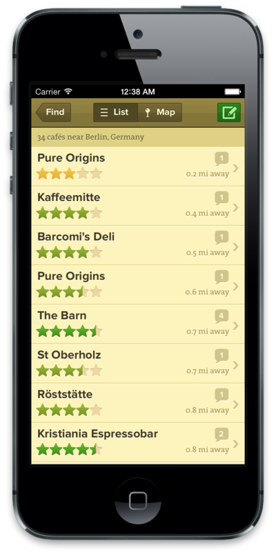
Unless our users want to stop and admire our search field and big green button, we can do a lot better than this. This isn’t content. It’s functionality, and it should be as invisible as possible. A much better idea would be to jump straight to the list of cafes, around the user’s current location:
When people open Decaf Sucks, it’s usually because they want to find coffee now. The alternative action, looking for a different location, is much less frequent and can be hidden behind a button in the toolbar. It doesn’t need prime real estate on the first screen of the app. So what we can do is completely remove the first screen and start showing useful content right away.
This is a good start, but we can do better still, by thinking more deeply about what our “content” really is. It’s not just a list of cafes, it’s the user’s context, their location relative to the cafes around them. It’s not enough just to crave a macchiato and see some text saying a café is 200m away; you should also know where that café is and what path you might take to get there. This is where the map view shines. We’ve had a map right from the app’s first release and for all these reasons it’s one of the most useful ways to find cafes. But it’s still hidden behind a button press. There’s no quick way to get an immediate, at-a-glance understanding of the caffeine landscape that surrounds you.
We can solve this by combining the map and list views:
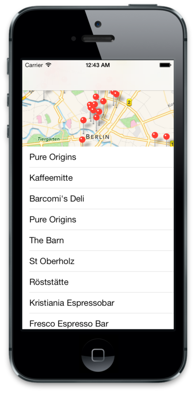
After this, when the user launches the app, not only will it be already primed for their current location, they’ll also see the nearby cafes both in a map and a list, and can choose to interact with whichever representation is most useful to them.
These are the main design changes we’ll make for Decaf Sucks 2. We’ll condense three screens into one and present useful content as early as we can. If this takes you to a suitably excellent coffee a few seconds earlier, then our mission will be accomplished!