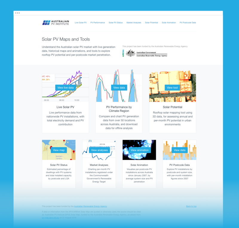
Solar PV Maps
Mapping and datavisualising Australian solar energy
We’ve been working with the Australian PV Institute to build a range of interrelated data products for exploring photovoltaic solar energy generation. Users include researchers, solar-industry professionals, government and advisers, journalists, and students.
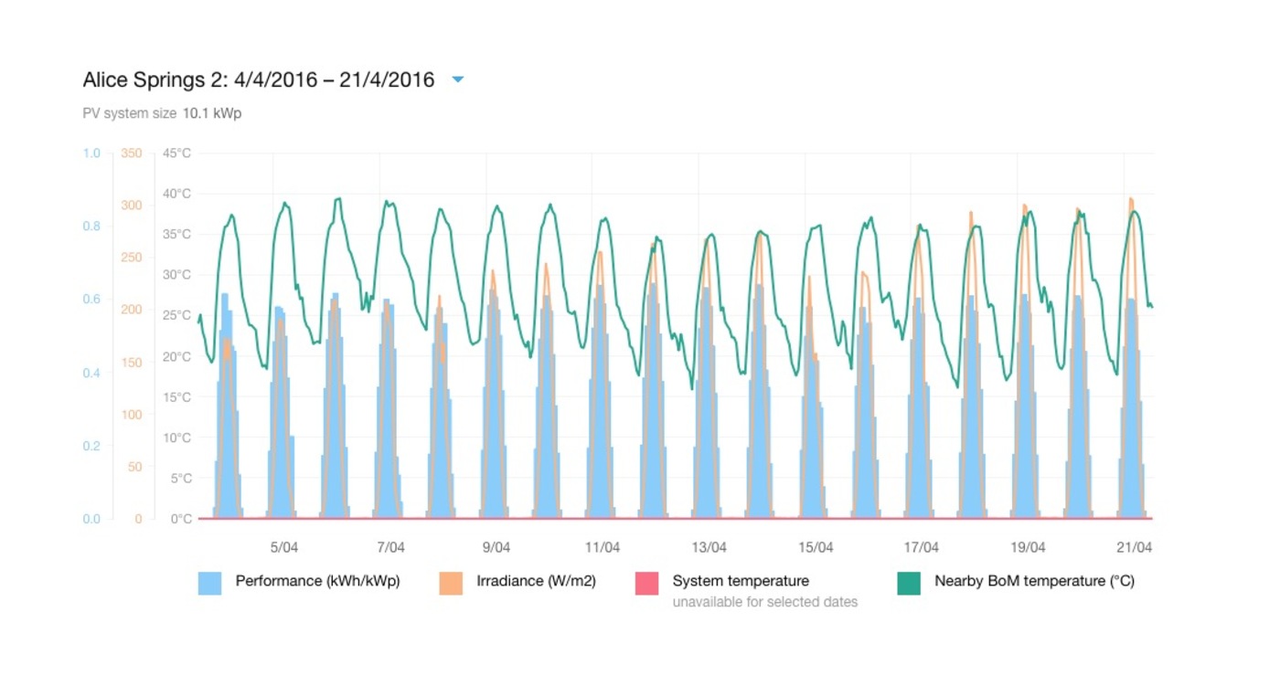
Live performance
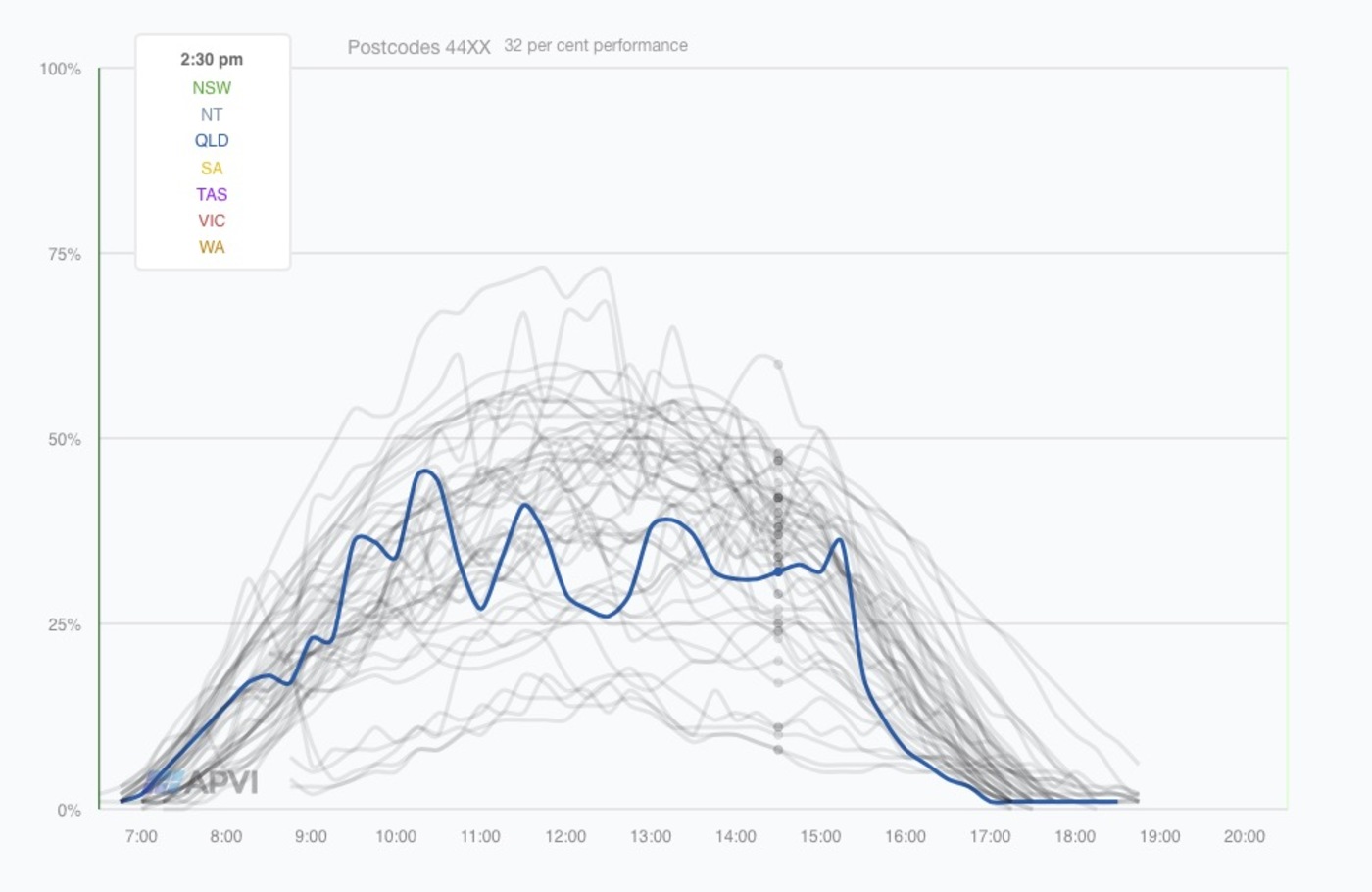
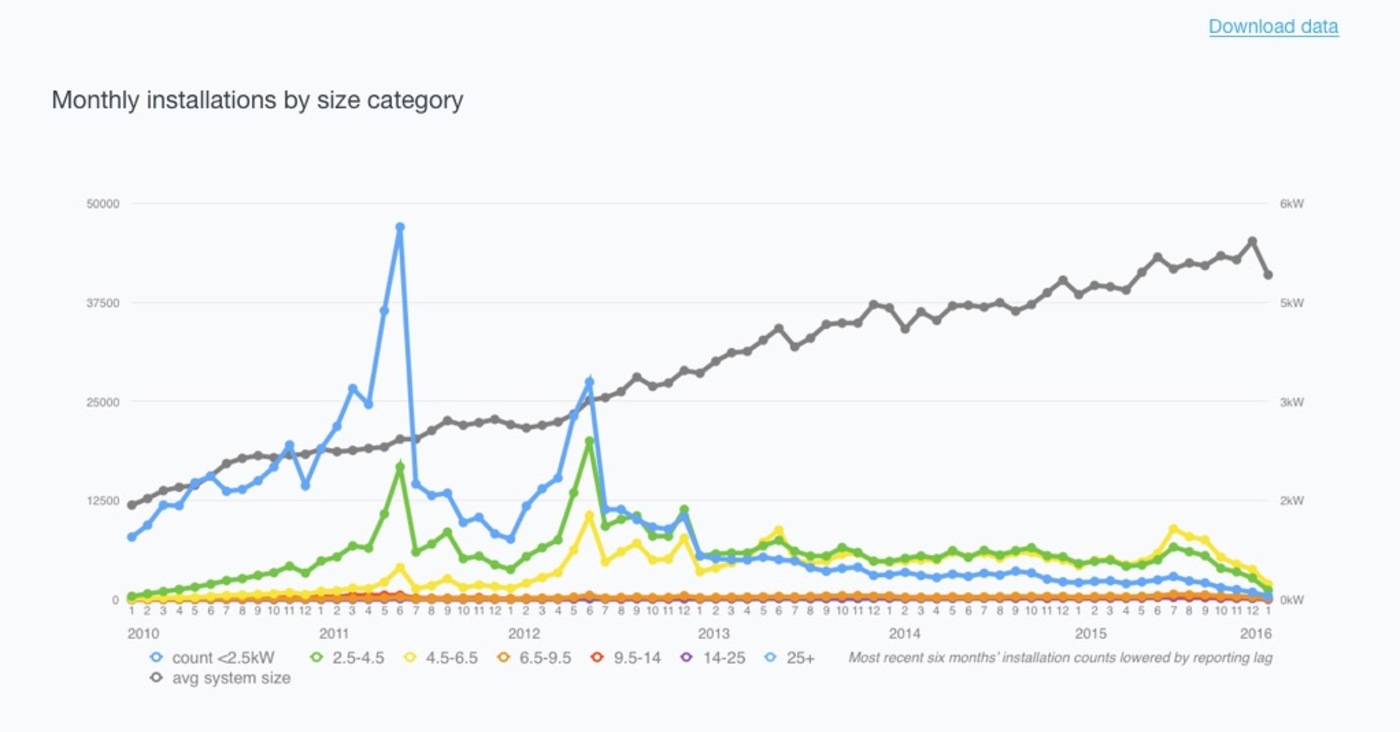
Detailed charting
Rich analysis
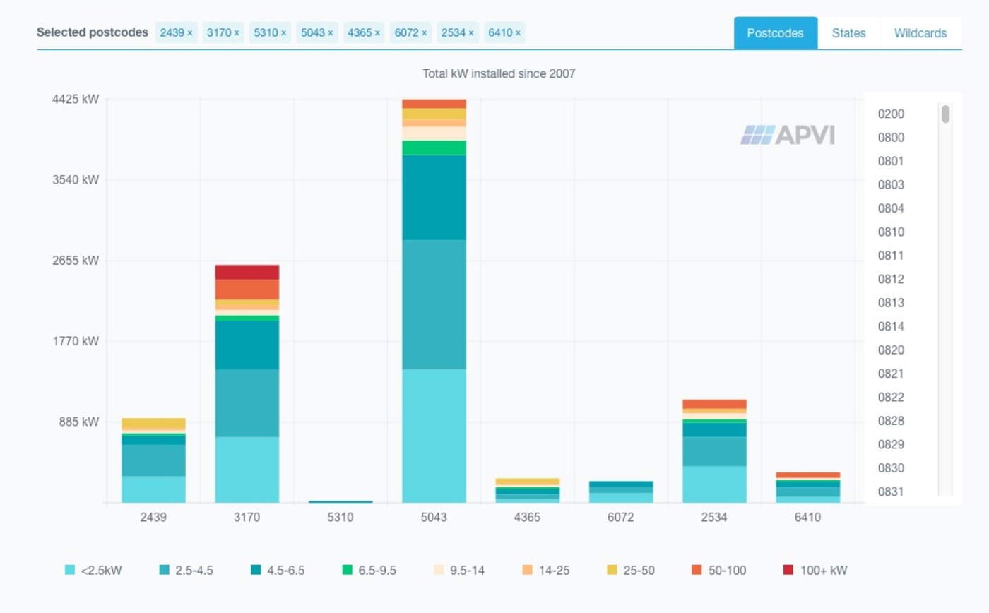
Installation data
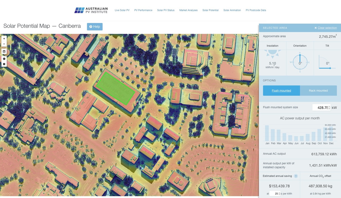
Solar potential tool
Market data
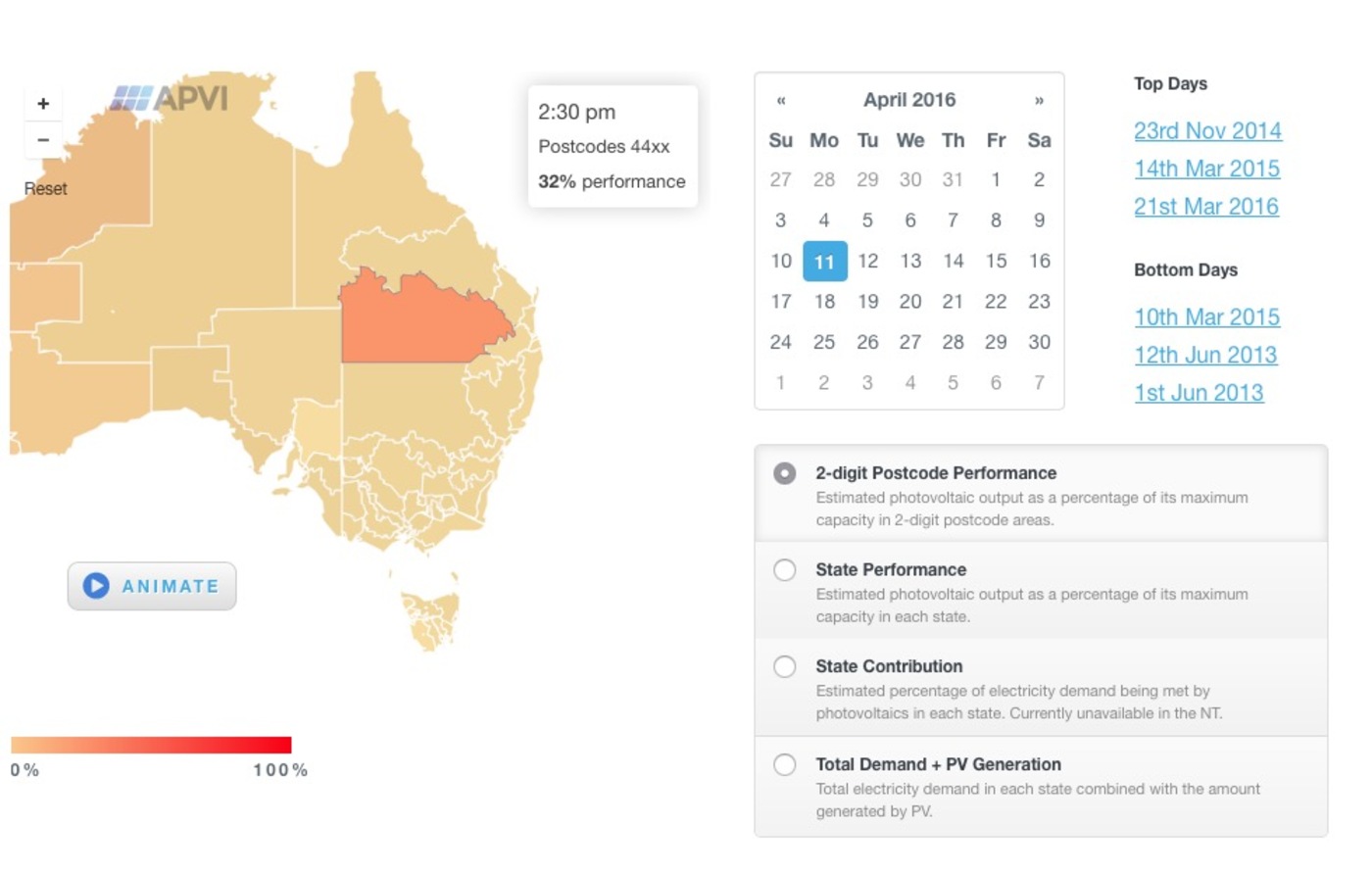
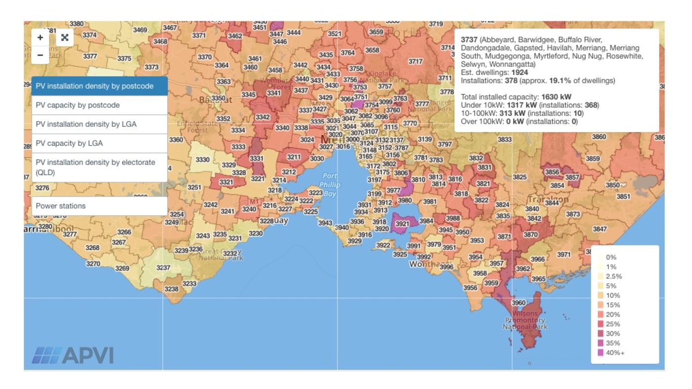
Interactive maps
Animation
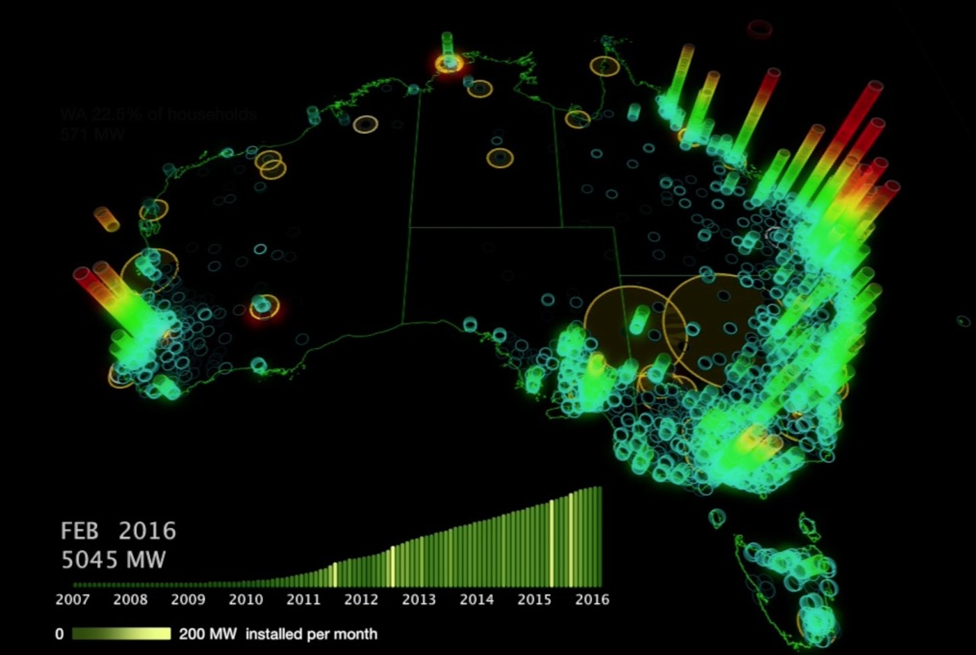
The site uses a range of technologies, including InfluxDB for time-series data storage and Mapbox for interactive mapping. Live maps are updated at 15-minute intervals: installation data is compiled regularly from data provided by the Clean Energy Regulator.
The site won the ENERGY GLOBE Australia award in 2015.